Customizing UI Themes - Icons and UI Controls
A UI Theme is customized by adding information to the UI Theme description file that overrides the base (Light or Darcula) UI Theme.
UI主题描述文件语法简介
主题描述文件的语法遵循键值对的JSON开放标准文件格式.
最小有效默认文件是[DevKit Theme Wizard]的输出(themes.md #icreating-a-ui-theme-with-the-devkit-theme-wizard).
添加键值对可自定义主题.
UI主题键值对通常使用颜色作为“值”.
颜色由六位RGB或八位RGBA十六进制表示法定义.
UI主题参考实现
在学习新语法时,将一些现有实现用于参考通常很有用.
例如,请参阅IntelliJ IDEA _High Contrast_主题的主题描述文件.
##自定义图标
UI主题可以自定义默认IntelliJ IDEA UI图标的颜色,或者将默认图标替换为默认图标.
通过在主题描述文件中添加一个“图标”:{}`部分来完成定制.
###覆盖图标的全局颜色
通过将键值对添加到“ColorPalette”:{}`部分来自定义默认的全局图标颜色.
必须在icons部分插入ColorPalette.
In the following example the key - the default red color (#DB5860) used for Action icons in the Light Theme - is overridden to the value of a different color (#D61A26):
{
  "name": "Theme Basics",
  "dark": false,
  "author": "IntelliJ Platform SDK",
  "editorScheme": "/theme_basics.xml",
  "ui": {
  },
  "icons": {
    "ColorPalette": {
      "#DB5860": "#D61A26"
    }
  }
}
This color substitution is applied throughout the IDE UI.
###自定义图标调色板颜色
图标选项板是预定义的UI主题颜色键,每个颜色键描述“操作”或“对象”上下文中的单个颜色.
####“动作”和“对象”上下文中的图标颜色
IntelliJ IDEA具有为“Actions”和“Objects”上下文定义的默认图标颜色.
*Actions是出现在工具栏上下文中的图标的主题键,表示_Compile_,_Run_或_Debug_等操作.
*Objects是出现在列表和树的上下文中的图标的主题键,表示文件,符号或运行和调试配置等实体.
为“Actions”和“Objects”键定义颜色的默认十六进制RGB值.
请注意,本文档将“对象”键称为“名词图标”.
####自定义“动作”和“对象”图标颜色
通过向主题描述文件中的“ColorPalette”:{}`部分添加“Actions”或“Objects”键和自定义颜色“值”来定制图标调色板颜色.
可用图标“Actions”和“Objects”键的列表由编辑器中的完成弹出窗口提供:
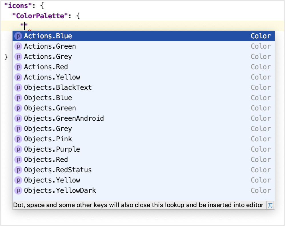
For example, the following key-value pair changes the color for all blue-colored icons on toolbars to the color #5BC0DE:
{
  "icons": {
    "ColorPalette": {
      "Actions.Blue": "#5BC0DE"
    }
  }
}
This more specific change to the Actions.Blue color overrides the default definition.
It will also, in the narrower context of blue Actions icons, supersede any global color overrides of the default blue icon color.
###自定义图标
默认的IntelliJ IDEA UI图标可以由自定义图标替换.
图标的文件格式为SVG.
JetBrains平台UI指南图标具有图标的详细规范.
在主题描述文件的“icon {}”部分中描述了图标替换.
请注意,图标替换键值对出现在“ColorPalette”部分之外.
对于图标替换,“key”是默认图标图像的路径.
此路径来自[AllIcons.[Group].[IconName]`[UI Inspector]报告的图标部分中的路径(/reference_guide/internal_actions/internal_uii.md).
For example, the Build (hammer) icon in the toolbar has the path Allcons.Actions.Compile as reported by the UI Inspector.
Therefore the key for the Build icon is /actions/compile.svg.
The value is the file name of the replacement icon, located in the resources folder of the UI Theme plugin project:
{
  "icons": {
    "/actions/compile.svg": "/factory.svg"
  }
}
The color of a replaced icon takes precedence over any ColorPalette overrides.
##自定义UI控件
UI主题可以更改IntelliJ IDEA UI中更多常规控件的外观.
这些控件的示例包括标签,按钮,复选框,树,列表和菜单.
###自定义UI控件颜色
通过将键值对添加到主题描述文件的“ui”:{}`部分来指定UI控件的自定义颜色.
UI控件key的复合格式为element.property,其中:
*element是UI控件的类型(标签,复选框等).
*property是颜色的应用方式.
示例包括foreground,background和errorForeground`.
请注意,某些UI控件键有两个以上的部分,例如Popup.Advertiser.foreground或ScrollBar.Mac.Transparent.thumbColor.
必须使用完整键来自定义特定按钮控件.
但是,出于其他目的,第一部分可以被认为是element,最后一部分被认为是property.
查找UI控件键的方法在查找UI控件的属性键部分中.
####使用相同属性自定义所有UI控件颜色
所有具有相同“属性”部分键的UI控件都可以设置为相同的颜色.
使用主题描述文件中的通配符“”*“:{}`部分完成此自定义.
在此部分中插入键值对,但仅指定键的“property”部分.
value是自定义颜色.
The following example would change the default background color to #AED7E3 for all UI controls:
{
  "ui": {
    "*": {
      "background": "#AED7E3"
     }
  }
}
Note that the wildcard "*": {} section must be within the "ui": {} section.
Customizing the Color of Specific UI Control Types
The color of a specific UI control types are changed by adding a key-value pair to the "ui": {} section of a Theme description file.
The key is the full element.property format and the value is the custom color.
The following example sets the background color for all labels to the color #F6E9C9
{
  "ui": {
    "*": {
      "background": "#AED7E3"
     },
    "Label.background": "#F6E9C9"
  }
}
The Label.background entry supersedes, in the narrower context of label backgrounds, any default color as well as any wildcard color assigned to backgrounds.
###自定义UI控件的边框
UI控件中使用的边框的颜色和几何形状可以通过主题描述文件中的键值对进行自定义.
边框键的格式是element.property,其中:
*element是包含边框的UI控件类型,例如窗口或弹出菜单.
*property是所需的边框外观,例如:
*border是指定为顶部,左侧,底部和右侧宽度的边框宽度(以像素为单位).
边界颜色也(可选地)被指定为十六进制RGB,例如,
“E6E6E6”没有“#”字符.
*borderInsets是从element边缘到边框的插入距离(以像素为单位).
它被指定为top,left,bottom和right insets.
用于识别UI控制键的方法在查找UI控件的属性键部分中.
####自定义特定UI控件的边框外观
通过向主题描述文件的“ui”:{}`部分添加键值对来自定义特定UI控件类型的边框外观.
The following example sets a new border width and color for all windows:
{
  "ui": {
    "Window.border" : "4, 4, 4, 4, E6E6E6"
  }
}
In this example the customized border supersedes the default definition and any global color override.
##查找UI控件的属性键
IntelliJ平台UI中定义了数百个UI控件element.property键.
可以从UI主题参考实现中收集应用它们的一些键和策略.
对于常规搜索,这里有一些用于定位UI控件键的建议方法.
###在编辑器中使用代码完成查找UI控件键
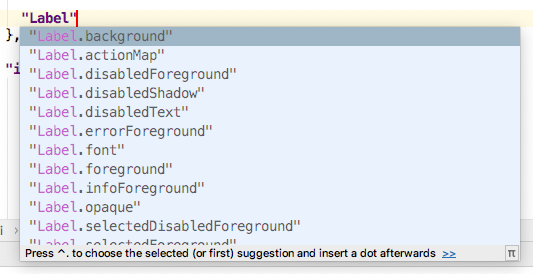
查找UI控件键的首选方法是使用IntelliJ IDEA编辑器中的代码完成功能.
请注意,代码完成功能提供的某些键可能已被弃用.
“ui”:{}`部分中的新条目将调用代码完成弹出窗口,如下所示:
###使用Laf Defaults UI查找UI控件键
使用Laf Defaults检查器,输入键的“element”部分.
Laf Defaults检查器将提示UI控件键列表及其默认颜色.