Exposing Theme Metadata
可以在自定义主题中使用的所有可用UI自定义键必须在专用的* .themeMetadata.json文件中定义,该文件通过com.intellij.themeMetadataProvider扩展点注册.
以下最小示例演示了在公开插件UI的UI自定义键时所需的所有详细信息.
/resources/META-INF/plugin.xml:
<idea-plugin>
  [...]
  <extensions defaultExtensionNs="com.intellij">
    <themeMetadataProvider path="/META-INF/MyPlugin.themeMetadata.json"/>
  </extensions>
  [...]
</idea-plugin>
/resources/META-INF/MyPlugin.themeMetadata.json:
{
  "name": "My Plugin",
  "fixed": false,
  "ui": [
    {
      "key": "MyComponent.border",
      "description": "The border for my component. Not used anymore.",
      "deprecated": true,
      "source": "com.myplugin.MyComponent",
    },
    {
      [more keys...]
    }
  ]
}
-
name- 人类可读的名称,例如插件名称 -
如果元数据描述外部元素,例如UI库,则默认为“fixed” - “false”,“true”
-
ui- 列出所有自定义键的根元素: key- 自定义密钥名称(参见密钥命名方案)description- 向主题作者编辑* .theme.json文件显示的描述- 当不推荐使用密钥时,“弃用” - “true”,如果可用,请在“说明”中提供说明和/或替换
source- 底层UI组件实现的FQN
Color keys can be used via JBColor#namedColor providing defaults for Light and Dark theme:
private static final Color SECTION_HEADER_FOREGROUND =
  JBColor.namedColor("Plugins.SectionHeader.foreground", new JBColor(0x787878, 0x999999));
其他键可以通过javax.swing.UIManager#getXXX()方法获得.
##密钥命名方案
所有键必须遵循此命名模式:
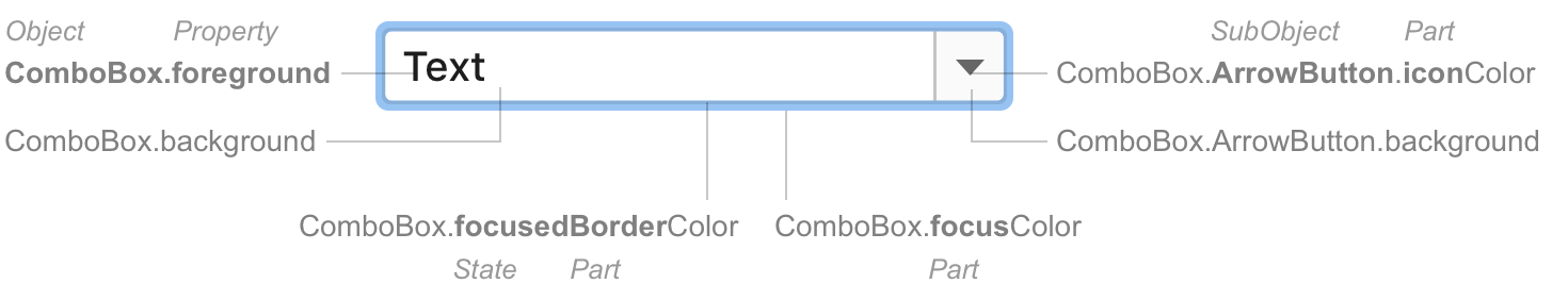
**对象[.SubObject] [状态] [部分] Property **
####财产
| Word | Use for | Example |
|---|---|---|
foreground |
Text color. | Label.foreground |
background |
Background color for objects with text. | Label.foreground |
<part>Color |
Objects with a single color (do not have foreground/background). Do not use the word “Color” separately, always use with the “part” word. The word “Color” shows that this is a color property. Otherwise, it can be confused with a property of another type. |
Popup.borderColor Group.separatorColor |
####状态
| Word | Use for | Example |
|---|---|---|
Active |
Enabled components, default state. Omit this word. The default state does not need explicit naming. | Notification.background |
Inactive |
Enabled components that might be perceived as interactive but are actually not. Example: a tree with visible selection but not in focus. Goes after other state words. | Tree.inactiveBackground ToolWindow.HeaderTab.hoverInactiveBackground |
Focused |
The current focused component. | Button.focusedBorderColor |
Selected |
A selected tab or any other control that has equally meaningful selected and inactive states. | ToolWindow.HeaderTab.selectedBackground |
Hover Pressed |
An action as indicated in states. | Link.hoverForeground Link.pressedForeground |
Error Warning Success |
Validation states. See example in the guide article. | ValidationTooltip.errorBackground ValidationTooltip.warningBorderColor |
Disabled |
Unavailable components. | Label.disabledForeground |
####部分
部件是组件的内部元件,例如组合框中的箭头按钮. 如果零件的属性与父对象不同,则为零件创建单独的密钥.
如果某个部件在多个组件中很常见,请使用相同的名称. 常见部分的显着例子:
| Common parts | Use for | Example |
|---|---|---|
Accelerator Shortcut |
Shortcut foreground. | Menu.acceleratorForeground Editor.shortcutForeground |
Border |
A line around a component. | NavBar.borderColor |
Caret |
The vertical line that denotes typing place. | TextField.caretForeground |
ModifiedItem |
An object that has been modified but not yet saved. Example: change anything in the Settings dialog, the setting group name in the tree becomes blue. |
Tree.modifiedItemForeground |
Focus |
Wide focus border around a component. | Component.focusColor “Component” is a special key that sets common properties for several basic input components. |
Info |
Secondary labels with additional useful information. Usually appear in gray color to the right or below a regular label. | CompletionPopup.infoForeground |
Icon |
An icon that is created with a source code (not an image file). | Table.sortIconColor |
Selection |
The focus place in a component with selectable text. Can be in a typed text or in a list or tree. Goes before other state words (for historical reasons). |
TextField.selectionForeground Tree.selectionInactiveBackground |
Separator |
A horizontal or vertical line inside a component. Can be with a label. | Menu.separatorColor |
Shadow |
A shadow below a component. | Button.shadowColor |
SubObject
在为以下某项创建密钥时使用子对象:
- 实施变化. 通常具有与父对象类似的一组UI属性键. 例子:
- 默认按钮:
Button.Default.background -
工具窗口通知:
Notification.ToolWindow.errorBackground - 具有自己的UI和行为的复杂组件的内部较小组件. 例子:
- 工具窗口选项卡:
ToolWindow.HeaderTab.inactiveBackground - 弹出窗口底部的提示文本:
Popup.Advertiser.background
####渐变色
如果组件具有渐变颜色,请为渐变的开头和结尾添加单词“start”和“end”. 例子:
-
Button.startBorderColor/Button.endBorderColor -
SearchMatch.startBackground/SearchMatch.endBackground
####资本化
大写对象和子对象. 使用lowerCamelCase作为属性.
不使用
| Do not use | Use instead |
|---|---|
Color as a separate word |
<Part>Color |
Outline |
borderColor |
Text |
Foreground |
darcula and other look-and-feel names |
Omit |
####摆动遗产
某些颜色键未根据上述规则命名. 此类密钥继承自Java Swing,并且出于兼容性原因无法重命名.
请勿使用旧密钥中的命名模式.
Swing键的示例:
-
activeCaption正确:WindowsDialogHeader.background -
Button.disabledText正确:Button.disabledForeground -
TableHeader.background正确:Table.Header.background
IntelliJ平台元数据
元数据分为以下几种:
-
IntelliJPlatform.themeMetadata.json- IntelliJ平台和自定义UI组件的所有键 -
JDK.themeMetadata.json- 来自Swing组件的所有键
新密钥应仅添加到IntelliJPlatform.themeMetadata.json(或相应的“本地”* .themeMetadata.json文件中,如果适用).
请确保遵守密钥命名方案并按字母顺序排列密钥.